After a few years under their belt, the Mole Doctors were ready to ‘grow up’ their brand – one that was more sophisticated and contemporary, while also reflecting the doctors' skill and experience (and making room for more services later down the track).
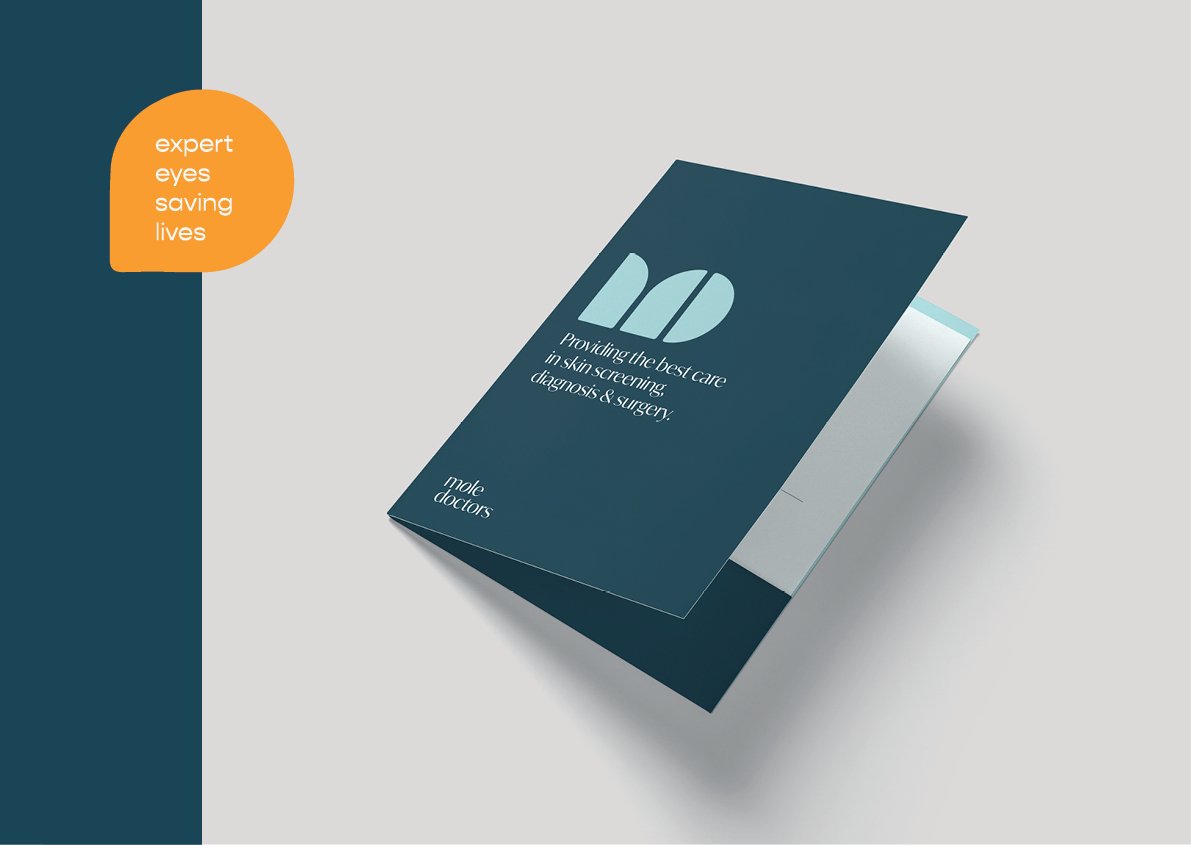
“Expert eyes, saving lives” – this is what they have been doing for a decade. This Brand Story became the solid base from which the brand identity was built. There was just one 'stowaway' from the original brand set to come along for the ride – the little mole superhero character!
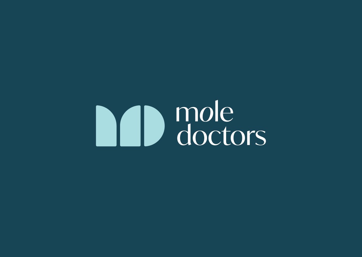
The Mole Doctors icon, made from abstracted shapes forming an ‘M’ and ‘D’, inherently feel soft and approachable. This icon was paired with a contemporary typeface and an irregular ‘o’ as a nod to the work conducted by Mole Doctors. Blue is a colour synonymous with the medical industry, with darker hues linked to feelings of trust and reputability. This colour was paired with a bright sky blue, orange and blush to energise and give a modern twist. When put together, the brand reflects the business – reputable, contemporary, bold and trustworthy.
Agency: Mount Deluxe. Creative Director: Sarah Delaney.
branding
website
stationery
illustration
signage


